
Samsung Catalyst Fund
Client Workshops
Brand Positioning
Visual Identity
Web Redesign
Client: Samsung Catalyst Fund
Project: Samsung Redesign
Agency: Big Drop Inc
Role: Creative Director
I had already worked on a few Samsung projects, however, Samsung Catalyst Fund had brand development in scope.
We conducted weeks of interviews and workshops to better define the brand’s identity, messaging and voice, concluding that the brand would promise things like knowledge and growth and would seek to establish a “tech mentor” dynamic.
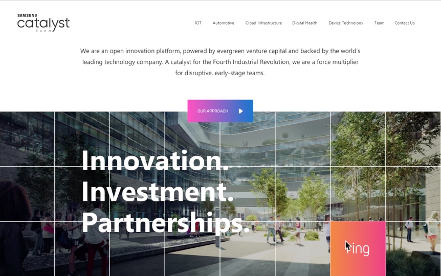
We tried out a few logo concepts but the Samsung brand wouldn’t allow for much flexibility. The team’s visual identity was limited to small adjustments to the type arrangement and formatting, along with an introduction of minimal block elements that would be worked into content floating panels and rectangles that provided correspondence for the Samsung type hierarchy.
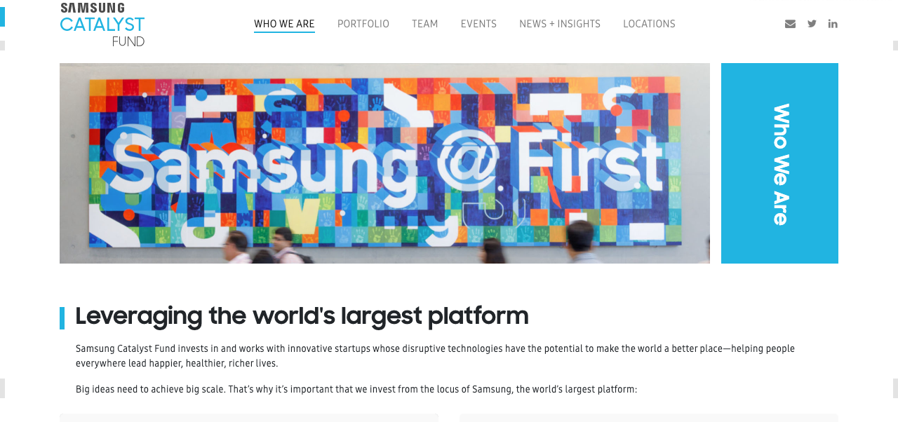
A few mood boards were developed that established a future-facing minimal aesthetic for our web design that were simple but smart and still felt innovative. A responsive long-scroll format was adopted for the homepage design to help SCF hit all of their initiatives and feature many of their strengths.